I've been busy staying on top of everything. This is the time of year when I really focus on studio time, and try to maximize the heck out of every minute spent in here. Having a deadline helps me to complete more commission work.
That said, I'll keep this short!
But consider yourself invited on over to my website to read my Fall 2006 Newsletter.
As always, thanks for your time,
Kim
Kimberly Kelly Santini
www.turtledovedesigns.com
distinctive pet portraits
& 4-legged paintings
Sunday, November 12, 2006
Friday, October 27, 2006
Keeping Things Moving Along
Motivation can come in some odd forms.
I started a new practice last week, and formalized it into an actual challenge this week. That of completing a warm-up painting every day before starting on a larger work. (See www.paintingadogaday.blogspot.com )
One would think that the added work involved in completing a painting each day would be detrimental to one's overall production. But it's worked in just the opposite fashion.
The little completed studies actually get my juices going so well that I'm able to jump into a larger canvas and be more productive with a smaller amount of time.
Go figure.
Kim
Kimberly Kelly Santini
www.turtledovedesigns.com
distinctive pet portraits
& 4-legged paintings
Thursday, October 19, 2006
The Canine Art Guild - Today's Endeavor
For almost a year now I've been working on establishing a new artists' group just for us dog painters.
It all started as a discussion on the Equine Art Guild forum between a number of artists who regularly painted dogs. We were moaning and groaning about there not really being a place to share ideas or network about all things related to painting canines.
Enough of us stepped forward and started making notes. Those notes became To-Do lists. Those To-Do lists are getting completed. And now we have the CAG, or Canine Art Guild.
Check us out: Canine Art Guild
Our membership is growing. We have a great cross-section of artists and styles.
And if things continue as they have been, our community will continue to grow and amaze.
Today I worked on compiling a canine resources guide that will be published on the Canine Art Guild website (for members' only viewing). This listing will be all encompassing, from art supplies to framing to website development to the history of pet portraiture.
It was one of the last things on my list.
The next one will be recruiting new members (wanna join?) and identifying and establishing strong links to add to the site.
But tomorrow I get to paint.
Kim
Kimberly Kelly Santini
http://www.turtledovedesigns.com
distinctive pet portraits
& 4-legged paintings
Tuesday, October 10, 2006
Artist Books
I have just returned from another meeting, this one that of the Romeo Guild of Art. Although still a relatively new member, I love these meetings. The business part is typically dealt with in a 1/2 hour, followed by a break for food and mingling (so far there has always been chocolate, which combined with art-speak is a huge win-win). But the real kicker is the tail end of the meeting, which is some sort of presentation about a technique or process.
Tonite's was on art book publishing.
Not those coffee table books with the zillion glossy photos of art.
No, these were original artist made books, one of a kind or small editions (small meaning around 100 copies), handmade, incredibly detailed and gorgeously intricate.
The presenters told their tale, wittingly, of travelling the traditional publishing house road. And then they segued into the remarkable world of handmade books.
Specialty papers, intricate typeface, drawings, various prints, collage, digital media, ephemera. All these things and more linked with some sort of common thread - an idea, an image, a letter.
It got my juices going right there.
What a great way to summarize all the legwork that goes into a portrait - thumbnail sketches, jotted notes, photographic details, color swatches. A perfect thank you gift for an extraordinary client.
What a great way to explore the thoughts behind a pursuit. Like taking the travel sketchbook or diary one step further. A wonderful add-on for clients already owning a piece belonging to a particular series.
What a great way to package the traditional artists' portfolio. It would really set my imagery apart from everyone else's, if not simply at the level of desire. And I am currently reworking my portfolio in preparation for a class I'm teaching on professional and portfolio development next month.
Hmmm...... think I need to get to work!!
Kimberly Kelly Santini
www.turtledovedesigns.com
distinctive pet portraits
& 4-legged paintings
Friday, October 06, 2006
Metamora's Celebration of the Horse
Also known as inspiration.
That's what last weekend's event meant to me.
The village of Metamora invited several different breed representatives to their downtown, and set up small paddocks for the horses. The weather was uncooperative on Saturday, but Sunday dawned bright and crisp, so I grabbed my camera and headed out.
What a treat!! So much eye candy!!
A vanner mare and foal. Two donkeys. A halflinger. A miniature mare and her foal. A fresian. A belgium. A morgan.
These will all grace new paintings in the months to come.
Can't wait to get them started!
But I need to work on some commissioned pet portraits first. Right now I'm working on a triple dog portrait, a fun airedale terrier painting, and am putting the finishing touches on a long haired cat. You can see them on my works in process page.
Once I complete these paintings, I'll pick up and work some more on the "Horse as Landscape" series, and use some of the reference photos I shot last weekend at the Celebration of the Horse.
Stay tuned!
Kimberly Kelly Santini
www.turtledovedesigns.com
distinctive pet portraits
& 4-legged paintings
Wednesday, September 27, 2006
Packing and Shipping Artwork
I spent a good chunk of yesterday packing up all my pieces for the "Driven" exhibition at Skyline Farms in Yarmouth, Maine. Seems like only yesterday I was collecting images and brainstorming for painting ideas for this show….
It took far more time preparing the works than I had anticipated. This is my first invitational exhibition, so I’ve got a little bit of a learning curve, too.
I labeled, inventoried and tagged each of the paintings. This is a normal procedure for me, but I also wired and prepped them for hanging (which is something I typically leave for the customer to take care of).
I went over their surfaces with a clean tack cloth (it wouldn't do for them to arrive with cat hair!), and wrapped them in brown paper. Then each package was labeled again with my contact information and the paintings’ title.
I grouped them by size, shipping 2 pieces to a crate, with their faces inwards/towards each other. I wrapped each parcel with strapping tape, to avoid any shifting or rubbing that might occur during shipment.
Then I nestled the parcels into airfloat crates. For those of you who don’t know about airfloats, they are boxes made specifically for shipping artwork. The paintings are literally nestled – a bottom layer of egg-foam, a central perforated layer of foam (you remove a portion to snug the painting into the center of it), and an upper layer of egg foam. The box itself is lined and puncture resistant. These crates make for worry-free shipping, honestly.
So, after I got the paintings into their respective boxes, I labeled the inside of each box (gotta make sure that my crates come back to me!) and also included an inventory. Two actually - a master list of all the paintings going to the show, and also a packing list of what was only in that box.
The packing list included photographs of each painting, along with insurance values. This way my paintings will be returned in the same packaging and configuration.
The show opens on Saturday, October 7th, at 5pm. There will be a reception with the artists (sadly, I will not be in attendance) through 8 pm. THe show will hang from Sunday, October 8th through Sunday, October 29th. Their hours are Sat-Sun 1-4pm, and Wed from 6-8pm.
Now I’ve got several other juried exhibitions I’m starting to think about and prep paintings for, but for the most part, will focus the next few months mostly on commission works. Nothing like a pet portrait for the holidays!!
I still have a few more openings for holiday gift giving. If you are thinking about commissioning a pet portrait as a gift, please drop me a line (ksantini@turtledovedesigns.com), and we can discuss your project in greater details.
Kimberly Kelly Santini
www.turtledovedesigns.com
distinctive pet portraits
& 4-legged paintings
Tuesday, September 12, 2006
Welcome Back!
Well, it would appear as though I fell off the face of the earth. But appearances can be deceiving. Life got so hectic, that I did drop many details, one of which was blogging. Shame on me.
But I’m back now.
What are some of the things that have been happening?
I created a new body of work – some pieces of which I was blogging (note to self: return to those blogs and update with completed images) – for the invitational show at Skyline Carriage Farms Museum this fall. These pieces are a continuation of my studies in limited palette, but also incorporated some experimentation with edges and line. Some of the horse (and mule) paintings are on my website: V is for Vanner, Patience, Follow the Leader, Daybreak, and Listening.
I have embarked upon a new series of paintings. Called “The Horse as Landscape,” these pieces use cropping and unusual angles/points of view to create a - surprise! - landscape. I’ve completed probably 4 or 5 of these, and have a few others in process. There’s been overflow into my canine work too, with a piece starring a yellow lab as beachfront property. You can view this lab painting as she progresses.
I’ve been doing live painting demos at street fairs, art shows, and the state fair.
I’ve been actively exhibiting in southeastern lower Michigan (even got a piece, “Swish,” accepted into The Community House’s 2006 Our Town exhibition).
I’ve committed to teaching painting classes at the Orion Art Center for this fall, along teaching with a new course on artistic growth and portfolio development.
And the Canine Art Guild is in full swing, as well. We are actively recruiting members and compiling data to add to our website.
On top of that, I had a fabulous summer break with my family. We got to visit all sorts of wonderful places, visited with even more wonderful people, and thoroughly enjoyed the perks of having no set routine whatsoever.
It doesn’t get much better than that.
But it's back to school. While the dog spends his days pining for lost kids, I'm busily working on commissions and preparing work for new shows. After all, I need to paint the images of the summer sun while they are still fresh in my mind.
Kimberly Kelly Santini
www.turtledovedesigns.com
distinctive pet portraits
& 4-legged paintings
Tuesday, July 11, 2006
New Horizons
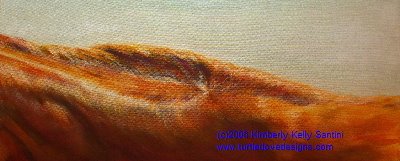
Back last winter, I painted a flea bitten gray horse, butt to the viewer, cropped in tight, so that the curve of his hindquarters and back created a horizon against a clear sky. Prior to him, I did a lifesize study of the fall of a bay horse’s mane (Daybreak, 20x10, acrylic on gallery stretched canvas), again, creating a landscape. With these two pieces, I had inadvertantly stumbled across an idea I needed to further explore.
This is the next piece in that series, now titled “Horizon” (after the first piece, which carries that name). This painting, titled “Red Hills, Chestnut Horizon," depicts the crest of a thoroughbred’s neck, warmed by the sun, and rolling like the Kentucky hills where I took the reference photo (see the entry “Inspiration Xs 100”).
Painted only with cadmium red deep, cadmium yellow deep, and pthalo blue red, with some titanium white. I’m getting the hang of this restricted palette, warm in sun vs cool in shadow, sort of thing.
Hope you enjoy it.
Now I’m off to do another - the nite's still young!
Kimberly Kelly Santini
www.turtledovedesigns.com
distinctive pet portraits
& 4-legged paintings
Thursday, June 22, 2006
Inspiration Xs 100
I had the chance of a lifetime earlier this week to visit a stellar thoroughbred breeding farm in Lexington, Kentucky. The horses were beyond beautiful – they were quite literally muses, dancing in the sunlight. I came home with over 600 photographs, and even more fragments burned into my brain.
As I step through my new reference materials, I am falling in love all over again with all that the equine embodies – grace, spirit, heart, beauty. I will soon be painting these ideas and emotions, set into the framework of the bluegrass and rolling lines of fencerow.
Meanwhile, I’ve gotta figure out how to come down from my adrenaline rush, and get some sleep.
Kimberly Kelly Santini
www.turtledovedesigns.com
distinctive pet portraits
& 4-legged paintings
Monday, June 05, 2006
New Beginnings
Well, I guess I couldn't get enough of my first blog (the one you are reading!), so I opted to start a second!
Actually, once I got to thinking (always a dangerous venture!), I realized that a blog dedicated to the progress of specific animal portraits would be beneficial. I already do something similar in the studio, with a paintings' log/sketch book. While I love the information that book has provided, I've outgrown it's usefulness in the last 6 months - I need more information on the paintings, both as they are developing, and after the fact.
So, I have started a secong blog: www.turtledovedesigns.blogspot.com.
As of today, current pet portraits and animal paintings, works in process, are still published on my website. As my website is also a work in process itself, that structure is subject to change. The wet paint page on my site will alwats contain current paintings on the easel (check today's date against that of the post). This new pet portraits and animal paintings blog will hold a small history of paintings and their evolution.
If you are interested in seeing a complete pet portraits or animal paintings portfolio (I fondly refer to them as 4-legged paintings), that is always available on my website.
Paintings for sale can also be viewed there, on the "Available for Purchase" page.
And, there is additional information on the whole commission process, too.
What I hope is that separating my blogs into two parts - lessons learned from the actual work - will help with my clarity. Also, structuring work in process on the new blog, with sequential entries in the form of my comments, will help restructure the actual process on any given work. (As I have 6 or more pieces in process at any given time, this will be especially useful to me!)
Please bear with me, as it may take a day or two to get some content built on that second blog page. I'm juggling this along with some other exhibition deadlines and three young children with major cases of spring fever.
As with all my websites (and my artwork), I invite your feedback. You have no idea how instrumental your thoughts are to steering my directions (or perhaps distractions) of tomorrow. Feel free to send emails (including any copyright-free photos you think I might find inspirational) to ksantini@turtledovedesigns.com.
THANK YOU!!
Kimberly Kelly Santini
www.turtledovedesigns.com
distinctive pet portraits
& 4-legged paintings
Friday, June 02, 2006
Another Lesson
I had another lesson with portrait artist Vianna Szabo, yesterday. She continues to open my eyes and mind, and does so with such ease, it’s scary. Here are a few of the things I am still mulling over.
IMPORTANT – I am painting light, not objects. Seems pretty basic, but it’s a tough one to keep in the forefront of one’s mind when faced with the complexity of a carriage horse’s harness.
LIGHT: There are 5 kinds (as identified by John Singer Sargent) - not to be confused with the temperature of the light
1. Light
2. Shadow
3. Mid-Tone
4. Accents
5. Reflected Light
I had only consciously been thinking about the bottom three. I think for me, paying better attention to the subtle variations within the realms of light and shadow will add to the luminosity of the painting, and better compliment the depth of field.
MIXING COLOR/COLOR CHOICES: First attack the value, then identify hue and temperature, and then finally the intensity. When analyzing the above, it is incredibly helpful to isolate the spot in question. Vianna gave me a blank white index card with a small hole cut in the middle of it. Amazing how something that appears violet in front of me became bluer when viewer through the card. This helped me with mixing the right shade on my palette.
PAINTING APPROACH: Vianna attacks her paintings in sections, concentrating on the relationship of the areas in one part of her composition, but at the same time, consciously thinking about the light and how it’s bouncing through and around the objects. Conversely, I seem to work in batches, mixing one puddle of paint, and applying it across the surface. Modifying my approach – keeping more paint on my palette at any given time – allows me to mix gradations for more subtler value and temperature shifts. I’m anxious to put this idea to work on a larger canvas.
NOTE: Paint drying too quickly on your palette? Having to mix colors so much so when adding mediums, that you lose the density and interest of a looser combination? A trick I recently learned from a student of mine (thank you Laura!), was to puddle glazing medium overtop a blob of acrylic paint on my palette. The medium keeps the pigment from drying out, and mixtures can retain their “ribboned” quality easily.
After class, she invited me to stay and watch a segment of a Richard Schmit video. I was convinced that Vianna made things look easy, but then I watched him, and my mind was blown away.
My theory is that their eyes are trained so well in isolating a particular item, and they are so familiar with their pigments and materials, that everything falls together seemingly without effort. Practice makes darn close to perfect.
So I’m off for some practice myself.
Kimberly Kelly Santini
www.turtledovedesigns.com
distinctive pet portraits
& 4-legged paintings
Friday, May 26, 2006
A Wedding Gift

Years ago, my neice handed me a stack of photos upon her return from a long vacation through northern Canada, and joking said to use them as inspiration for her wedding painting. We had a good laugh - she wasn't even dating anyone seriously - but the photos were beautiful shots of sunrises over vast expanses, with lots of interesting architecture and sort of an old world feel. Not my typical subject matter choice, so I dutifully filed them away, and sort of forgot about it.
Then, two Christmases ago, she got engaged. After the bubbly was passed around, and the euphoria had settled in, I remembered those photos tucked into a drawer in my studio, and couldn’t wait to dig them out.
I chose a wonderful old Montreal building façade, with overflowing window boxes greeting a late morning sun. I did a few sketches, a value study or two, and then floundered when it came to choosing the painting size. The file sat buried on my desk, yet again forgotten.
A few months ago I stretched a nice sized canvas, 18x24, and blocked the painting in. Not confidant of my abilities to paint straight lines, it hung on my wall, ostensibly for me to study while deciding what the next step would be. Of course, it got a little dangerous, when I remembered at the last minute to stash the painting in a closet prior to a visit by the bride to be. And there the painting sat, again, seemingly never to be tackled with abandon.
That ended this morning. After all, the wedding’s only 8 days away, and there’s nothing like a deadline to get me going!
I modified my palette a little for this one. Cadmium red dark, cadmium yellow dark, and azurite hue. The azurite gave a lovely green tint to the grays, which played up the limestone façade beautifully.
I did find myself wanting to reach for a darker blue, as the azurite is essentially a stain, and didn't lead to terribly dark values. But I exercised some restraint, and left it as is. For now.
I also am considering cropping the sky and dormers out…… and still need to clean up the mullions and trim on the windows. I'll live with it for the weekend, and see what it tells me it needs come Monday morning.
But overall it’s not such a bad painting (coming from someone who does pet portraits exclusively!), and one more example of how important it’s been for me to step out of my comfort zone.
Kimberly Kelly Santini
www.turtledovedesigns.com
distinctive pet portraits
& 4-legged paintings
Thursday, May 25, 2006
2006 Flower Fair
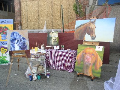
Last Saturday I had the best time! I set up my easel on the streets of downtown Lake Orion, as part of their annual Flower Fair street festival. Not only did the sun actually shine (we hadn’t seen it’s face in a10 days), but because of a last minute cancellation on “artists’ way,” I garnered a booth-sized space.
Having planned only to work on one canvas, I hadn’t arranged for a tent or any sort of formal setup. Thanks to my husband (who returned to the house for a second load!), I was able to set up both easels and a small table with an array of works, both finished and in process. They are, from left to right:
- Untitled (two black dogs), from the Larger than Life series, 24x24 (standing on my new Julian plein air easel, which I adore!!), exhibition painting (I highlighted this one in another blog post below, see "Symphony in Blue").
- Sunbather (horizontal cat painting on top of table easel), from the Larger than Life series, 16x8, available for purchase.
- Untitled (white cat painting on bottom of table easel), from the Larger than Life series, 18x14, exhibition painting.
- Red (chestnut horse painting), from the Larger than Life series, 54x28, available for purchase.
- Fergie (viszla head study), from the Larger than Life series, 36x36, commissioned pet portrait.
I met some amazing people, took photos of one unbelievably personable dog (Boomer, a labradoodle), actually accomplished quite a bit on the painting in question, and thoroughly enjoyed myself. Overall, a highly successful day.
The piece I worked on, an as of yet untitled painting of two border collie mixes, came quite a ways during the course of the day. I am happy with the layers of blues and purples in the undercoats of the black dogs, and short of an adjustment I’ll make to correct the length of the smaller dog’s nose, I am relatively close to starting on the final layers.
Thanks to everyone who stopped by – and a very special thank you to Holly Hatfield of Red River Vizslas, who brought Thyme all the way from Kentucky to meet her painting, which is available for purchase.
Kimberly Kelly Santini
www.turtledovedesigns.com
distinctive pet portraits
& 4-legged paintings
Tuesday, May 16, 2006
Untitled (but Lucy)

I have had the inspiration photo for this painting for about 6 weeks now. I knew I wanted to soften the image, but wasn’t quite certain how to go about that. So I tried several smaller studies, which have been staring me down from my desk – none of them quite captured the modified sense of light I was looking for.
So how did I solve this problem? I went bigger and I chose 4 completely different colors. Yeah, that doesn’t make any sense – to step away from all the studying I had been doing with the new palette these last few months, and try something entirely different on an even bigger scale.
But somehow it worked.
So here’s Lucy, almost finished. At 18x14 she’s larger than life, but serenely unpretentious. I used primarily Quinacridone Red, Cad Yellow Dark, Azurite Hue and Cobalt Blue. I reached for some Raw Umber, Cad Red Med, and Bone Black for minute details around the eyes and collar. The two blues combined to give some interesting green to blue to violet shadows, but one thing I did realize was that this combination of colors did not give me a dense enough neutral (hence the addition of bone black).
I want to make the ground richer and darker still, and might lay down another layer or two of a red glaze, but I’m going to live with the painting for a little bit first, and see if she tells me anything else.
And she needs a title, too - I'm open to suggestions. Usually they come to me while I’m working, but nothing rose to the surface today. Initial thoughts are “Bells” or maybe “Wren” or “Sparrow” – something alluding to her bird hunting skills. But then the old standby is just her name, “Lucy.”
Thanks to Erin Chop for allowing me to “borrow” Lucy for a bit – I would love to paint her again. Hint, hint, Erin - send more photos!! (grin)
Actually, for those of you reading this - I am always looking for inspiration. You are welcome to send me photos of your dog or cat for consideration for my next painting. You may send your materials via email to ksantini@turtledovedesigns.com, with the subject line of "New Model." I am currently preparing work for a number of shows that call for canine, feline, and equine characters.
Meanwhile, I’m planning to enter this painting in the Birmingham Michigan’s Community House October 2006 juried exhibition, titled “Our Town.” I will keep you posted if she makes the cut.
Kimberly Kelly Santini
www.turtledovedesigns.com
distinctive pet portraits
& 4-legged paintings
Tuesday, May 02, 2006
Quiet Progress
Yes, it’s been quiet at the easel. I’ve been working on two very large pieces, a 36” square dog portrait, and another 36”x48” large dog painting. Because of their sizes, the progress is slow. I am enjoying their growth, and continuing to learn so much from putting Vianna’s lessons to work.
It’s also the end of the month, when I complete the bulk of my volunteer work. I am so blessed to be able to work as an artist, that I feel compelled to give back in a variety of ways. Ironically, those “ways” all involve committee meetings and projects that occur within a 10 day timeframe.
I’ve been immersed in the creation of a new artists’ group. Called the Canine Art Guild, it’s a group providing support, education, and numerous other resources for all canine artists. I’ve been busy building a database and collecting information and content for the website.
I’m also taking an online course on search engine optimization and website marketing. This is part of a long term goal to revamp my website. While I love the simplicity of using a WYSIWIG design program, it simply does not provide enough flexibility with the coding, which seriously compromises my search engine results. The changes I’m implementing now are not huge visual ones, but rather infrastructure changes. But they will make a world of difference in the traffic I’m able to draw.
There’s far more that goes on in the studio than flinging color!!
So am off to varnish a couple of poodle portraits, stretch a new canvas for a sweet little yellow lab puppy portrait, and see if I can’t make some progress on the emails sitting in my inbox…….
Kimberly Kelly Santini
www.turtledovedesigns.com
distinctive pet portraits
& 4-legged paintings
Friday, April 21, 2006
Blindsided and Milestones
I was blindsided this week, when during my dental visit, my eyes happened upon a snapshot sitting on the hygienist’s shelf. The photograph was of her cat, outlined by a shaft of cool winter light – and that particular image contained all the elements I had been struggling with – color temperature and reflected light within a very straightforward composition.
It was a smack upside the head!
Ever since then, that image has been hovering in my peripheral. I spent tonight working on some studies – I used green shadows, then blue – which also meant that my light source changed from evening to morning. I had never done that before, and enjoyed the challenge of balancing the light source with its corresponding shadow.
I then played with the local color of the cat – first she had a soft gray tint to her fur, then a peach fuzz color. I concentrated on using the proper combination of color to model her, and was surprised to see how basic it was to get that bounced light effect when I really concentrated.
Of course, with all this pushing paint around and focus on the actual colors, I didn’t do such a great job with the whole drawing bit (hence the reason why there is no supporting image tonight!!). That will be my task tomorrow.
To take these palette mixing lessons I’ve learned and apply them to a correctly rendered drawing.
I might just keep this kitty piece, even though her eyes are misaligned, she’s got quite the chicken neck, and her ears are uneven – she’s a milestone of sorts. I’m starting to get it.
Kimberly Kelly Santini
www.turtledovedesigns.com
distinctive pet portraits
& 4-legged paintings
Tuesday, April 11, 2006
The Learning Curve
Today I had my first official class with Vianna Szabo, one of my painting heros. I had been stalking her on the internet, meaning that every week or so I’d hit her website (www.viannaszabo.com) and stare at her work. It was only a matter of time before our paths crossed, and I was fortuitous enough to have a friend in common with me when it happened. The rest, as they say, is history!!
After our class this morning, I came home and tried to commit to paper everything she said in the almost 3 hours we spent together. First thing learned – next time, take notes!! (or bring a recorder!!)
So many tips and treasures she shared seemed obvious, yet I hadn’t yet stumbled upon them. The most revolutionary thing being to set up my palette like a color wheel, placing all my paint down at once (today we used quinacridone crimson, hansa yellow medium, and ultramarine blue), with the white in the middle. Then, as I mixed, I was assured color harmony, and neutralizing colors became mindless – just reach directly across the circle for the compliment.
We worked on a still life made up entirely of white objects, dramatically lit with a warm bulb. It forced me to focus on the temperature of the warm light, and study how that light bounced off the objects and into the shadows. Despite the lack of strong local color in the setup, my finished painting is full of pinks, blues, and lavenders. I even squeezed some green and yellow (my two favs) into it.
I can see that I need to really study my subject more carefully though – I tend to want to race into lying the color down, and I don’t take the time to properly LOOK AT the objects I’m painting, to assure that the color I lay down is indeed correct. I was told squinting would help – not just to see the proper values, but also to determine the strength of the lines.
So more patience is called for, along with restraint and discipline. And some squinting.
But it’s not that bad. I am looking at things entirely differently now. Instead of before, when all I was seeing just the yellow of the sunlight on my daughter’s face, this afternoon I was drawn into the blues and purples of the shadows under her chin and across her cheekbones. I realized it was the subtlety of the color changes and the juxtaposition of the opposites (violet and yellow) that allowed that yellow sunlight to sing. I’m going to master those subtleties, no doubt about it.
It’ll take practice. And patience, restraint, and discipline. And squinting.
But I’ll get there.
Kimberly Kelly Santini
www.turtledovedesigns.com
distinctive pet portraits
& 4-legged paintings
Monday, April 03, 2006
Symphony in Blue
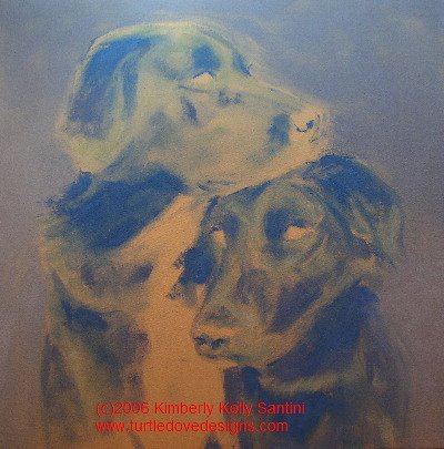
This 24" x 24" portrait has begun as a study in blue. It’s two black dogs, but the sheen on their coats hovers between a light blue and lavender. Contrasted with the deep violets and indigos of the shadows, and highlighted by orange and golden eyes, this will be stunning when done. And it’s the perfect excuse to try out an idea I’ve been fascinated with and working on and off with mixed results – using tonality, yet achieving great depth.
What does this mean? I want a painting that is primarily one hue, yet sings with color. It also must have a believable depth of field. Can I do it? Like the little engine, I think I can.
So here’s my underpainting, after a couple of hours of work. I’ve used primarily light ultramarine blue, Prussian, and pthalo. I’ve also added smidges of quinacridone red and Indian yellow.
I can see right away that my background is too intense. I need to gray it out and take it down at least two values in order to push the dogs forward. And I can also see some places where I’d like to redraw certain elements.
Next step will be to increase my range of values – right now I’ve got about 3 or 4, and I need to expand that to at least 10. I’ll also put some warmer shades into their muzzles, and start on the eyes.
And I’ll need a title, too.
Just a few things to take care of tomorrow!
Thursday, March 30, 2006
Ruff
Sometimes all it takes is an unusual angle to release me entirely. That’s what this painting did.
The inspiration photo was supplied by Juliet Harrison, a wonderful photographer working out of Red Hook, New York www.lechevalthehorse.com. This is her dog, Cody, a rough collie mix.
I focused exclusively on the light and texture, lying down the initial composition using indian yellow, pthalo blue, quin crimson, and naples yellow (ahh, a restricted palette, again - it's getting easier, folks!). Once I was happy with the modeling, I then let loose with glazes of some of my favorite shades – prussian blue (to push the shadows back a bit further), cadmium red, light magenta, cadmium yellow, van dyke brown, green gold. For the most part, I concentrated those touches of color around the focal point, and tried to keep all brushmarks extraneous to that focal point soft and blurred.
Overall I am very happy with the result. “Ruff,” 12x14, acrylic on army green canvas (with bits of the canvas strategically showing through), will be entered in the same show as “Innocence,” the puppy painting from last week.
Now it’s on to bigger and better. Am doing some preliminary studies for a larger (30” plus) head study of a Vizla named Fergie.
Tuesday, March 28, 2006
Copying the Masters
One of my first “homework” assignment as part of my new studies with Vianna Szabo included making smaller color studies of a few of my favorite paintings done by other artists. The reasoning behind this (I think) was to help me realize what elements contribute to a balanced composition and color scheme.
I’ve spent today doing a number of 8x10 and smaller paintings derived from a few of my favorite Wolf Kahn landscapes. What fun it has been to copy them – having the goal painting right next to me (well, ok, it’s a reproduction – as if I owned an actual Wolf Kahn! Hah!) while I work has allowed me to focus purely on color – the bulk of the other decisions have already been made.
I am amazed at he uses the same three or four hues consistently, just in varying combinations, within the same painting. How they get grayed or purpled out as they recede into the landscape. How he bounces bits of pure pigment around sparingly, to emphasize their intensity and pull your eye through the whole surface. Even though there are only a few main colors contributing to the piece, the color is saturated and balanced, and in my humble opinion, quite perfect.
It’s been a very fruitful day for me, despite the fact that the five paintings I created will never be for sale. BUT my creativity has been fed, I’m all the wiser for this experience, and I’m inspired to get going on the next portrait.
A POSTSCRIP: For hundreds of years, artists have learned by copying those who came before them. Copying is a fantastic way to LEARN. It is not a means, however, to earn a living. Should you choose to copy other artists’ work, protect yourself from copyright infringements by seeking their permission whenever possible and by taking the necessary steps to assure that the copied work does not hit the market and is never passed off as your own. We artists live by our skills and our reputation – one without the other is useless.
Friday, March 24, 2006
The Success of Restraint

Well, my stretcher bar order didn’t come in time for me to start Rosie yesterday, so I picked up with a reference photo and a stretched canvas I had on hand, and got started on a sweet little Vizsla puppy face. (The photo came from Holly Hatfield at www.redrivervizslas.com - I've painted several of her dogs).
I’m enamored with this breed – their coloring, a rich warm gold, turns to red in the shadow, and softens to pink and yellow in the sun. When you factor in the innocence of a new puppy’s gaze, ears to grow into, and all those extra folds of skin, it’s completely irresistible.
So, here’s the new piece, titled "Innocence," 12” square. It’s done on a medium toned army green linen, again using a limited palette (Naples Yellow, Indian Yellow, Pthalo Blue, Light Ultra Blue, and Quinacridone Crimson, tinted with Zinc White, details tinted with Titanium White). I really concentrated not so much on color temperature with this one (like I’ve been obsessed with in the past), but more on modeling the planes of the face as I painted, making every brushstroke tell a story. After I had the shapes established, I washed cooler glazes into the shadows (it’s easier to cool a warm than to go the other way). And, I had the background planned from the start, which made it easier to “bounce” color around, thus resulting in a more harmonious painting.
I think I might be onto something here, with this whole “restraint” idea. More to come…..
By the way, this painting will be entered in The Carriage Factory Gallery’s (Newton, Kansas) “Man’s Best Friend” exhibit taking place during the month of May (www.carriagefactoryartgallery.com). At Ms. Hatfield’s request, proceeds from its sale will benefit Vizsla research and rescue.
Another Red River Vizsla painting, “Driver,” can be seen on my website (www.turtledovedesigns.com, on the Wet Paint page). Again, proceeds from this piece’s sale will benefit Vizsla research and rescue. For more information, please contact me directly: ksantini@turtledovedesigns.com .
Tuesday, March 21, 2006
Color Journaling
In the last couple of days I’ve been rethinking my color journal. I started the journal several months ago, with the intent that it would help clarify which color combinations were the most successful in my work. Because I have at least 5 canvases going on at any given time, occasionally I would not be able to recall the exact formula I had used on a particular painting – I wanted this journal to also help me to keep track of the various palettes used with each piece.
Each page is dedicated to one painting. Headed by a quick thumbnail sketch, the page is full of my notes about the process of the painting, little daubs of color along with their formulas, and what paint combinations worked particularly well. I also try to make my own personal observations about how the color operated in that particular painting.
What I’ve learned from my journal is that it isn’t so much knowing secret color formulas that will make a painting really sing. The first thing I learned was that what worked very well in one painting as a neutral gray, read entirely wrong in another. Each painting needed its own combination, dictated by the local color and the light and mood I wished to obtain. The journal is very useful in that I can return to see what worked in a sunlit piece, and use that knowledge to build my palette for something similarly structured.
What I was very surprised to learn is that those paintings where I held back to only 5 or 6 tubes of paint had the strongest harmony and the best passages of color. That was earth shattering to me – I love surrounding myself with pots and tubes of paint, and using a great diversity of them in each piece. (NOTE: I believe this is part of my struggle with obtaining a greater sense of depth in my artwork – the variety of colors is competing with the drawing/composition for the forefront.)
It also become apparent that I need to do more thorough planning prior to starting a piece. I put this knowledge immediately into effect with my newest painting, “Willie,” a Staffordshire bull terrier portrait.
With Willie (shown at the top of this post), I’ve chosen a complimentary color scheme of orange and blue. The background is a rich grassy green, but I have grayed it with cad red dark (the same red I used to mix the oranges) so that it will recede and allow the dog to stand front and center. I also mixed the green using the same pthalo blue and Indian yellow in the dog. And I bounced softer variations of the background green off his nose and ears, to firmly place him in the picture plane.
Willie was painted with only 6 colors: Cad Red Dark, Light Magenta, Indian Yellow, Naples Yellow, VanDyke Brown and Pthalo Blue (all Golden heavy body acrylics). I tinted with Zinc White, but dropped in the details using Titanium. I am very happy with the range of color in this piece, despite the lack of variety in my palette.
Now onto the next portrait – Rosie, a black lab puppy. With her portrait, and subsequent ones, I’m going to focus on restraint. Restraint in the sense that I will restrict my palette, but also try to better utilize neutrals and grayed values so as to amp up the areas of higher color saturation, without having to resort to using lots of colors. It worked with Willie. We’ll see how it works (or not!) with the others……
Thursday, March 16, 2006
Introductions
Well, I'm finally biting the bullet, and entering the world of blog. I've been meaning to do this for a while now, but there always seemed to be something else shoving it's way to the top of my priority list. Today, however, something happened that simply had to take precedence.
A mentor of sorts, another artist, invited me to join her when she visited the gallery where my newest work was on display. This being my first solo show, featuring over 35 works, I was eager to hear her comments. The characteristics I most admire in her work (light and color) are two areas I am actively studying and trying to improve on.
Half fearful, but ever hopeful, I abandoned the painting at my easel, threw my brushes into some clean water, ran a comb through my hair, grabbed some lipstick, and headed out the door.
This blog is a direct result of that serendipitous meeting. While we discussed the nuances of color harmony, value ranges, blurred edges, gestural brushwork, and dissected my palette, I wished I had thought to bring a recorder or notebook along. I did race home and jot notes down, among which are several "homework" assignments, but then I got to thinking (whoops, first mistake!).....
I needed some sort of journalling. It would help me to recall what my goals were on a specific piece, and also give me a record of how I approached particular situations. It would also give me a forum to think things out. And a place where interested bodies could see the sort of ideas that swim around in the background of an artist's mind.
So, here it is, or rather, here I am! Welcome aboard.
I hope you find my musings entertaining at the very least - periodically informative, as well. Learn from my mistakes and share in the successes.
Meanwhile, I'm off to update my website, continue work on a little staffordshire terrier portrait, and finish up with some practice mixing warm and cool grays.
Subscribe to:
Posts (Atom)
