In the last couple of days I’ve been rethinking my color journal. I started the journal several months ago, with the intent that it would help clarify which color combinations were the most successful in my work. Because I have at least 5 canvases going on at any given time, occasionally I would not be able to recall the exact formula I had used on a particular painting – I wanted this journal to also help me to keep track of the various palettes used with each piece.
Each page is dedicated to one painting. Headed by a quick thumbnail sketch, the page is full of my notes about the process of the painting, little daubs of color along with their formulas, and what paint combinations worked particularly well. I also try to make my own personal observations about how the color operated in that particular painting.
What I’ve learned from my journal is that it isn’t so much knowing secret color formulas that will make a painting really sing. The first thing I learned was that what worked very well in one painting as a neutral gray, read entirely wrong in another. Each painting needed its own combination, dictated by the local color and the light and mood I wished to obtain. The journal is very useful in that I can return to see what worked in a sunlit piece, and use that knowledge to build my palette for something similarly structured.
What I was very surprised to learn is that those paintings where I held back to only 5 or 6 tubes of paint had the strongest harmony and the best passages of color. That was earth shattering to me – I love surrounding myself with pots and tubes of paint, and using a great diversity of them in each piece. (NOTE: I believe this is part of my struggle with obtaining a greater sense of depth in my artwork – the variety of colors is competing with the drawing/composition for the forefront.)
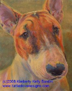
It also become apparent that I need to do more thorough planning prior to starting a piece. I put this knowledge immediately into effect with my newest painting, “Willie,” a Staffordshire bull terrier portrait.
With Willie (shown at the top of this post), I’ve chosen a complimentary color scheme of orange and blue. The background is a rich grassy green, but I have grayed it with cad red dark (the same red I used to mix the oranges) so that it will recede and allow the dog to stand front and center. I also mixed the green using the same pthalo blue and Indian yellow in the dog. And I bounced softer variations of the background green off his nose and ears, to firmly place him in the picture plane.
Willie was painted with only 6 colors: Cad Red Dark, Light Magenta, Indian Yellow, Naples Yellow, VanDyke Brown and Pthalo Blue (all Golden heavy body acrylics). I tinted with Zinc White, but dropped in the details using Titanium. I am very happy with the range of color in this piece, despite the lack of variety in my palette.
Now onto the next portrait – Rosie, a black lab puppy. With her portrait, and subsequent ones, I’m going to focus on restraint. Restraint in the sense that I will restrict my palette, but also try to better utilize neutrals and grayed values so as to amp up the areas of higher color saturation, without having to resort to using lots of colors. It worked with Willie. We’ll see how it works (or not!) with the others……

No comments:
Post a Comment