Thursday, March 30, 2006

Ruff


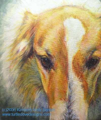
Sometimes all it takes is an unusual angle to release me entirely. That’s what this painting did.

The inspiration photo was supplied by Juliet Harrison, a wonderful photographer working out of Red Hook, New York www.lechevalthehorse.com. This is her dog, Cody, a rough collie mix.

I focused exclusively on the light and texture, lying down the initial composition using indian yellow, pthalo blue, quin crimson, and naples yellow (ahh, a restricted palette, again - it's getting easier, folks!). Once I was happy with the modeling, I then let loose with glazes of some of my favorite shades – prussian blue (to push the shadows back a bit further), cadmium red, light magenta, cadmium yellow, van dyke brown, green gold. For the most part, I concentrated those touches of color around the focal point, and tried to keep all brushmarks extraneous to that focal point soft and blurred.

Overall I am very happy with the result. “Ruff,” 12x14, acrylic on army green canvas (with bits of the canvas strategically showing through), will be entered in the same show as “Innocence,” the puppy painting from last week.

Now it’s on to bigger and better. Am doing some preliminary studies for a larger (30” plus) head study of a Vizla named Fergie.

Tuesday, March 28, 2006

Copying the Masters

One of my first “homework” assignment as part of my new studies with Vianna Szabo included making smaller color studies of a few of my favorite paintings done by other artists. The reasoning behind this (I think) was to help me realize what elements contribute to a balanced composition and color scheme.

I’ve spent today doing a number of 8x10 and smaller paintings derived from a few of my favorite Wolf Kahn landscapes. What fun it has been to copy them – having the goal painting right next to me (well, ok, it’s a reproduction – as if I owned an actual Wolf Kahn! Hah!) while I work has allowed me to focus purely on color – the bulk of the other decisions have already been made.

I am amazed at he uses the same three or four hues consistently, just in varying combinations, within the same painting. How they get grayed or purpled out as they recede into the landscape. How he bounces bits of pure pigment around sparingly, to emphasize their intensity and pull your eye through the whole surface. Even though there are only a few main colors contributing to the piece, the color is saturated and balanced, and in my humble opinion, quite perfect.

It’s been a very fruitful day for me, despite the fact that the five paintings I created will never be for sale. BUT my creativity has been fed, I’m all the wiser for this experience, and I’m inspired to get going on the next portrait.

A POSTSCRIP: For hundreds of years, artists have learned by copying those who came before them. Copying is a fantastic way to LEARN. It is not a means, however, to earn a living. Should you choose to copy other artists’ work, protect yourself from copyright infringements by seeking their permission whenever possible and by taking the necessary steps to assure that the copied work does not hit the market and is never passed off as your own. We artists live by our skills and our reputation – one without the other is useless.

Friday, March 24, 2006

The Success of Restraint


Well, my stretcher bar order didn’t come in time for me to start Rosie yesterday, so I picked up with a reference photo and a stretched canvas I had on hand, and got started on a sweet little Vizsla puppy face. (The photo came from Holly Hatfield at www.redrivervizslas.com - I've painted several of her dogs).

I’m enamored with this breed – their coloring, a rich warm gold, turns to red in the shadow, and softens to pink and yellow in the sun. When you factor in the innocence of a new puppy’s gaze, ears to grow into, and all those extra folds of skin, it’s completely irresistible.

So, here’s the new piece, titled "Innocence," 12” square. It’s done on a medium toned army green linen, again using a limited palette (Naples Yellow, Indian Yellow, Pthalo Blue, Light Ultra Blue, and Quinacridone Crimson, tinted with Zinc White, details tinted with Titanium White). I really concentrated not so much on color temperature with this one (like I’ve been obsessed with in the past), but more on modeling the planes of the face as I painted, making every brushstroke tell a story. After I had the shapes established, I washed cooler glazes into the shadows (it’s easier to cool a warm than to go the other way). And, I had the background planned from the start, which made it easier to “bounce” color around, thus resulting in a more harmonious painting.

I think I might be onto something here, with this whole “restraint” idea. More to come…..

By the way, this painting will be entered in The Carriage Factory Gallery’s (Newton, Kansas) “Man’s Best Friend” exhibit taking place during the month of May (www.carriagefactoryartgallery.com). At Ms. Hatfield’s request, proceeds from its sale will benefit Vizsla research and rescue.

Another Red River Vizsla painting, “Driver,” can be seen on my website (www.turtledovedesigns.com, on the Wet Paint page). Again, proceeds from this piece’s sale will benefit Vizsla research and rescue. For more information, please contact me directly: ksantini@turtledovedesigns.com .

Tuesday, March 21, 2006

Color Journaling


In the last couple of days I’ve been rethinking my color journal. I started the journal several months ago, with the intent that it would help clarify which color combinations were the most successful in my work. Because I have at least 5 canvases going on at any given time, occasionally I would not be able to recall the exact formula I had used on a particular painting – I wanted this journal to also help me to keep track of the various palettes used with each piece.

Each page is dedicated to one painting. Headed by a quick thumbnail sketch, the page is full of my notes about the process of the painting, little daubs of color along with their formulas, and what paint combinations worked particularly well. I also try to make my own personal observations about how the color operated in that particular painting.

What I’ve learned from my journal is that it isn’t so much knowing secret color formulas that will make a painting really sing. The first thing I learned was that what worked very well in one painting as a neutral gray, read entirely wrong in another. Each painting needed its own combination, dictated by the local color and the light and mood I wished to obtain. The journal is very useful in that I can return to see what worked in a sunlit piece, and use that knowledge to build my palette for something similarly structured.

What I was very surprised to learn is that those paintings where I held back to only 5 or 6 tubes of paint had the strongest harmony and the best passages of color. That was earth shattering to me – I love surrounding myself with pots and tubes of paint, and using a great diversity of them in each piece. (NOTE: I believe this is part of my struggle with obtaining a greater sense of depth in my artwork – the variety of colors is competing with the drawing/composition for the forefront.)

It also become apparent that I need to do more thorough planning prior to starting a piece. I put this knowledge immediately into effect with my newest painting, “Willie,” a Staffordshire bull terrier portrait.

With Willie (shown at the top of this post), I’ve chosen a complimentary color scheme of orange and blue. The background is a rich grassy green, but I have grayed it with cad red dark (the same red I used to mix the oranges) so that it will recede and allow the dog to stand front and center. I also mixed the green using the same pthalo blue and Indian yellow in the dog. And I bounced softer variations of the background green off his nose and ears, to firmly place him in the picture plane.

Willie was painted with only 6 colors: Cad Red Dark, Light Magenta, Indian Yellow, Naples Yellow, VanDyke Brown and Pthalo Blue (all Golden heavy body acrylics). I tinted with Zinc White, but dropped in the details using Titanium. I am very happy with the range of color in this piece, despite the lack of variety in my palette.

Now onto the next portrait – Rosie, a black lab puppy. With her portrait, and subsequent ones, I’m going to focus on restraint. Restraint in the sense that I will restrict my palette, but also try to better utilize neutrals and grayed values so as to amp up the areas of higher color saturation, without having to resort to using lots of colors. It worked with Willie. We’ll see how it works (or not!) with the others……

Thursday, March 16, 2006

Introductions

Well, I'm finally biting the bullet, and entering the world of blog. I've been meaning to do this for a while now, but there always seemed to be something else shoving it's way to the top of my priority list. Today, however, something happened that simply had to take precedence.

A mentor of sorts, another artist, invited me to join her when she visited the gallery where my newest work was on display. This being my first solo show, featuring over 35 works, I was eager to hear her comments. The characteristics I most admire in her work (light and color) are two areas I am actively studying and trying to improve on.

Half fearful, but ever hopeful, I abandoned the painting at my easel, threw my brushes into some clean water, ran a comb through my hair, grabbed some lipstick, and headed out the door.

This blog is a direct result of that serendipitous meeting. While we discussed the nuances of color harmony, value ranges, blurred edges, gestural brushwork, and dissected my palette, I wished I had thought to bring a recorder or notebook along. I did race home and jot notes down, among which are several "homework" assignments, but then I got to thinking (whoops, first mistake!).....

I needed some sort of journalling. It would help me to recall what my goals were on a specific piece, and also give me a record of how I approached particular situations. It would also give me a forum to think things out. And a place where interested bodies could see the sort of ideas that swim around in the background of an artist's mind.

So, here it is, or rather, here I am! Welcome aboard.

I hope you find my musings entertaining at the very least - periodically informative, as well. Learn from my mistakes and share in the successes.

Meanwhile, I'm off to update my website, continue work on a little staffordshire terrier portrait, and finish up with some practice mixing warm and cool grays.